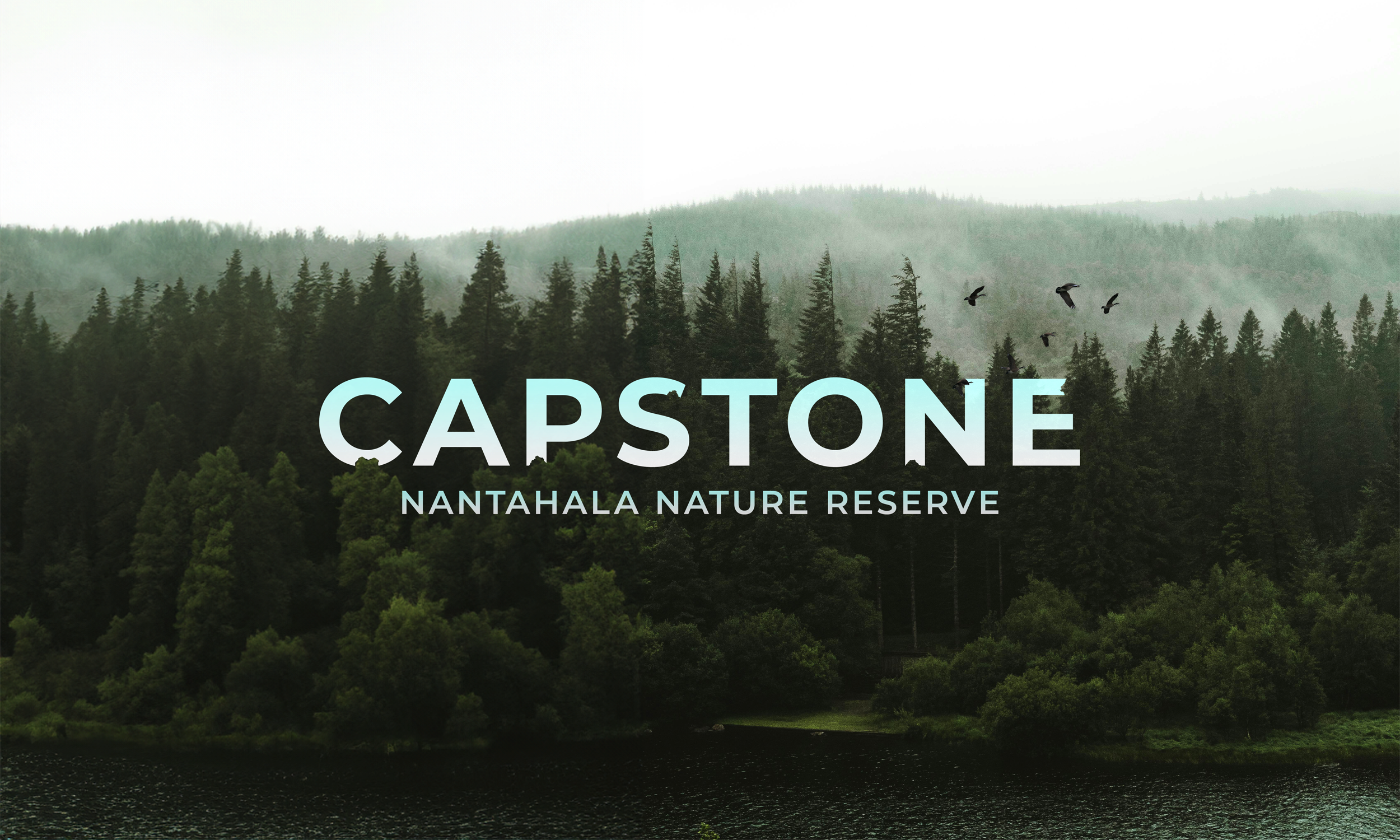
What is a nature reserve?
A nature reserve is an area of land or water that is designated and managed specifically to conserve the natural environment. These reserves are set aside to protect the native biodiversity of ecosystems from human activities that might otherwise threaten their survival. They serve as important refuges for wildlife, promote ecological research, and offer many educational opportunities.
Objectives
To independently research, design and produce a logo, website, five infographics, one trail map, eight trail markers, and three stickers for Nantahala Nature Reserve
To thoroughly research the history and overall aesthetic of state parks to incorporate into the design of each component of the project
To apply previous knowledge of the fundamentals of design and new-found research into branding, design, typography and layout of all components
To actively self-critique designs throughout entire process in order to improve quality of work
To comprehend and apply critique from peers and instructors whenever necessary
To create an identity in line with preexisting state parks while still creating a unique style
To produce a cohesive, successful design across all deliverables
Overview
Nantahala Nature Reserve is located near the Great Smoky Mountains in North Carolina and borders Tennessee. It is loosely based on Nantahala Outdoor Center; however, it emphasizes protecting and supporting endangered species rather than purely outdoor recreation.
Target Audience
The target audience will be families who enjoy outdoor recreation and learning about the natural world. The COVID-19 pandemic saw a significant increase in state park attendance across the United States, with 37 million in 2019 to over 45 million in 2020. While the primary audience is children interested in learning more about the environment, activities will be available to visitors of all ages.
Deliverables
Logo design for Nantahala Nature Reserve
Prototyped desktop website design (Adobe XD)
Five infographics
One trail map
Eight trail markers
Three stickers
Research
In my research, I primarily looked at the websites of state parks and outdoor centers as well as various related information graphics. I found that a common theme among these elements was that while they were abundant in information, they lacked a visual style and effective layout design. Based on this, I chose to focus especially on creating content that was clean and elegant, which separates it from other state parks and the like. I used Pinterest and Designspiration to find logos, graphics, and other visual elements that used the style I wanted. Most of the content I used in my design elements is pulled from various environmental charities, scholarly articles, and the Nantahala Outdoor Center.
Logo Process Work
Concept
When deciding where to locate my nature reserve, I researched several locations along the east coast of the United States. One region that stood out to me was Nantahala National Forest. This area is home to a small population of Manitoban Elk, a subspecies that was introduced to the Great Smoky Mountains in 2001. They have since expanded their habitat to include the Nantahala National Forest and surrounding areas.
As most elk species are largely contained in the Western regions of the United States and Canada, this small population interested me enough to base the design of my logo on it. I originally experimented with including a Fibonacci spiral in the bottom of the elk head; however, that proved too finicky and looked confusing. I then tried putting the elk in a circular container, which made the overall shape of the logo simpler and easier to understand.
After drawing out the concept, I digitized it and focused on refining the mark and choosing the right typefaces and colors.
Digital Process
Final Mark
Infographics
The infographics were the first element I worked on, so they dictated the style of future components. These are intended to be placed along hiking trails to inform visitors about any wildlife they may encounter. Each one follows the same design system and layout, however individual components in the infographic are different to add variety to the set.
The tone of the text is intended to be friendly and easy to read while still being informative. This goal is further supported by the simple color palette and clean layout. The animals chosen are all common sights along the Eastern coast of the United States, so visitors can learn about a species they are likely to see.
Trail Map and Trail Markers
Every nature center needs a trail map. For mine, I focused on making a simple and easy-to-read graphic of the terrain. The symbols next to each trail correspond to their appropriate trail marker, which helps visitors navigate the trails more easily. The topographic information can also inform guests of the terrain and difficulty of each hike.
Trail markers are an essential part of a good hiking trail system. These would be placed on plaques attached to trees along their respective path. Each marker is intended to be visually interesting, yet simple and easy to reproduce.
Here’s how they would look on the trail.
Stickers
While researching various nature stickers, I found they all fell into several categories. Some were very textural, while others focused on a unique shape and fun type selection. However, I saw that most deviated from the design system of their associated brand. Based on this, I chose to go beyond my established design system and experiment with different styles. That way, I can attract a wider audience with each design. For mine, I focused on using an interesting shape, font choice, and various textures to add depth.
These designs are also very diverse and can be applied to different mediums, such as shirts or hats.
Website
For my website, I wanted to focus on creating a clean, professional, and informative look that elevated the nature reserve. I experimented with incorporating the type into the image, as well as generous white space and elegant typography.


